Data Science using Python
Table of Contents
This course covers some basic knowledge regarding data handling with pandas and numpy as well as automatic plotting with matplotlib using a practical example from the Industry 4.0 model factory at the FH Aachen University of Applied Sciences.
Learning Outcome
Introduction
This course will teach you the basics of how to process and validate your data, as well as the basics and lessons learned when working with data. We'd like to provide a hands-on experience by having a practical course where you need to process data provided by us.
Requirements
If you're unfamiliar with Python or need a refresher, please prepare with the following courses:
What You Need
Hardware
- Laptop or PC
Software
- PyCharm Community Version
- Python 3.8 (or later)
Sources and Resources
- Pandas Intro Tutorials
- Flake8 Documentation
- Pandas Documentation
- NumPy Documentation
- Matplotlib Documentation
Task
Project Introduction
The practical course consists of:
- Reading and preprocessing sensor data
- Plotting the processed data (all)
- Feature extraction (from a column) and plotting
- Visualization of the aggregated data (all features of all columns)
The provided data used in this course was generated using a HackRF. The HackRF is a software-defined radio that can send or process radio signals. The measurement was conducted during a scientific project. The HackRF was used to measure the noise level as well as a periodically changing signal generated automatically by a WiFi access point.
Setting Up the Work Environment
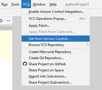
All required data and the prepared Python modules are available in a GitLab repository: DataScience Basics Repository.
- Fork and clone this repository (using HTTPS).
We recommend using a general entry point, for example, a module seminar/main.py that uses the modules you've created to fulfill the tasks presented in this course.
seminar.main as well as seminar.preprocessing are already created in the Git project. However, their program logic is not implemented yet.
We recommend creating more modules that fulfill a single task according to the project outline, i.e., seminar.plot, seminar.extraction, and seminar.final.
Use the module seminar as an entry point to execute the main function in seminar.main.
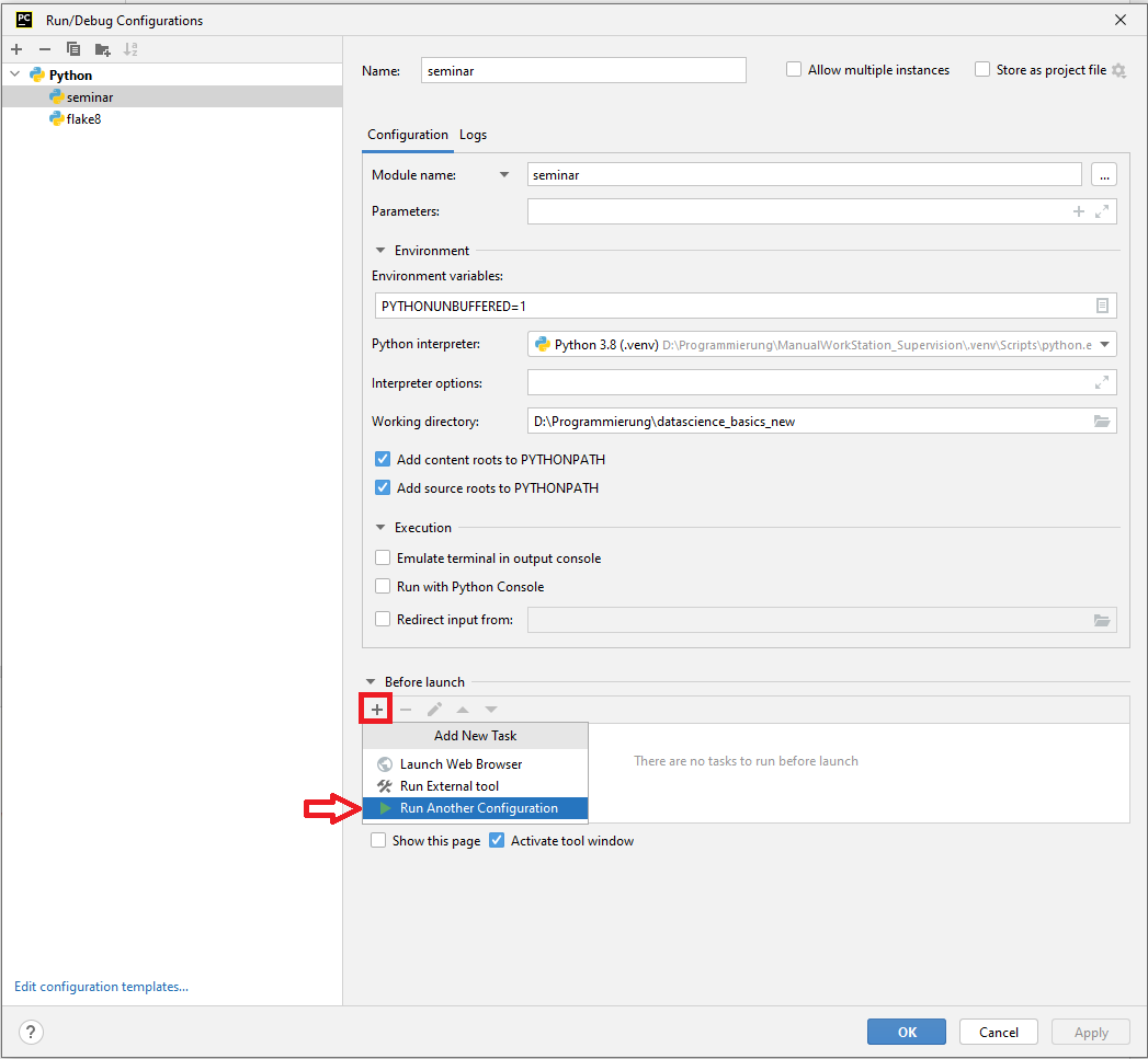
- Add a new Python run configuration to start the program logic in PyCharm.
- Add your module (here: the seminar folder) to the configuration.
- Set the working directory to your project folder.
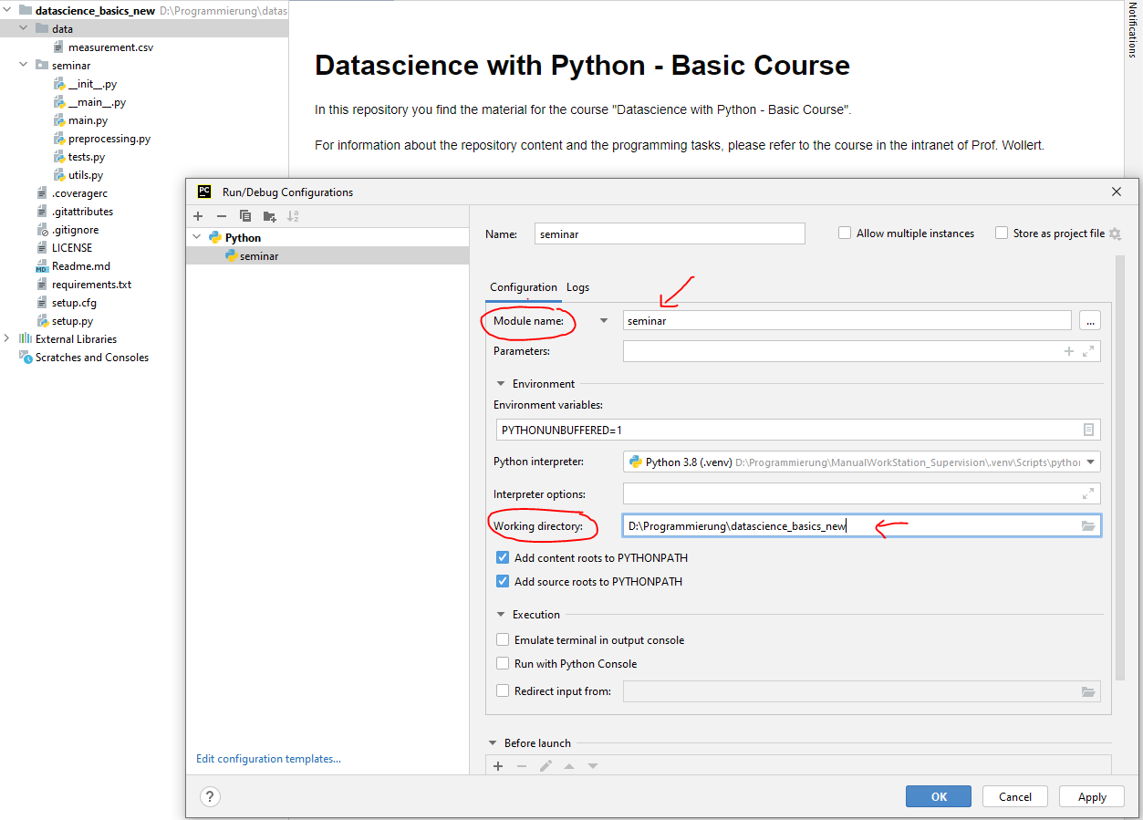
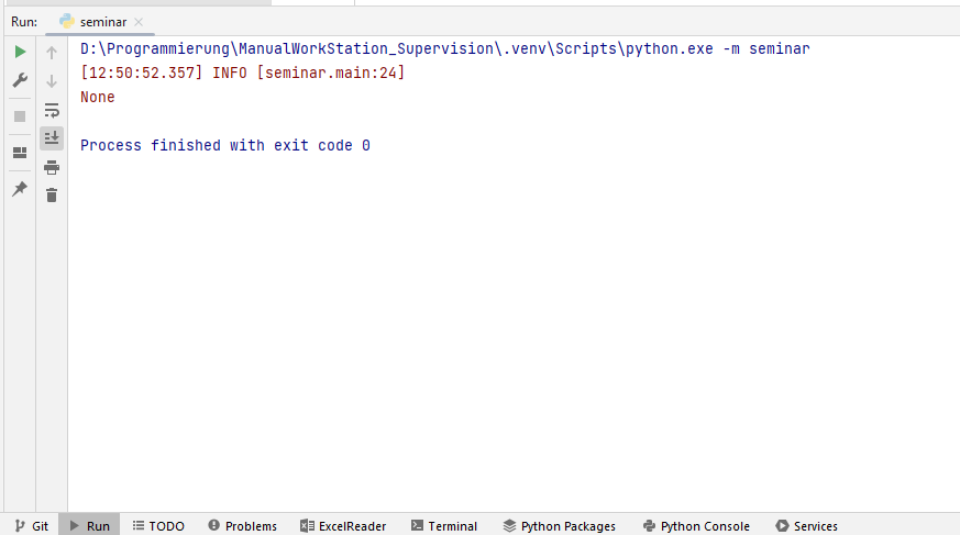
- Check if the main function is executed when you start the configuration. If everything works properly, you can see a logger information.
- Include style checking using flake8.
- Add the module which should be checked in
Parameters. - Set the working directory to your project folder.
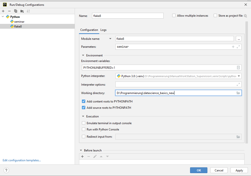
You can automatically check your programming style before executing the main program logic by adding the flake8-configuration to the seminar-configuration.
Understanding the Data Set
The data from data/measurement.csv was generated using hackrf_sweep and stored as a CSV file.
The CSV file does not contain a header; thus, documentation is needed to understand the rows of the measurement:
The first two columns are the timestamp of the measurement, followed by the low- and high frequency, the bin width, and the number of samples. The other columns contain the activity of the frequency in decibels, starting with the first bin reaching from (low frequency) to (low frequency + bin width) and ending with the last bin from (high frequency - bin width) to (high frequency).
- Check out the example data set here: hackrf_sweep Documentation
- Make sure the file
data/measurement.csvcontains data - it is distributed with an extension to Git (Git LFS) that might not be installed with macOS or Linux. Install Git LFS and use the terminal to download and update your data, i.e., trygit lfs checkout data/.
Course Goal
The goal of this course is to create a dataset which contains the signal strength in dB based on the frequency band starting points (lowest value of the frequency bands) and the timestamps.
Extract:
| datetime | 2400000 | 2400049 |
|---|---|---|
| 2020-06-02 10:38:38.852938 | -31.13 | -45.80 |
| 2020-06-02 10:38:38.872789 | -30.19 | -43.60 |
| 2020-06-02 10:38:38.892089 | -30.75 | -42.84 |
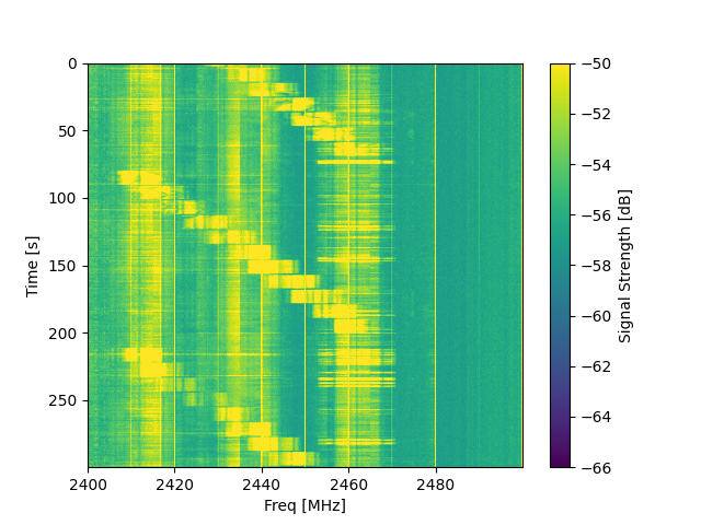
Based on this table, a waterfall diagram should be created which provides an overview of the data.
However, the obtained dataset provides some challenges:
- Adequate labeling is missing
- Existing data types do not automatically match expected data types
- There exist duplicate measurements for the same timestamps and frequency bands
- There exist invalid measurements (None values) in the dataset
Thus, several steps are required to obtain the cleaned dataset and the waterfall diagram.
Data Preparation
The following data preparation steps should be included in the module seminar.preprocessing.
- Use
pandas.read_csvwithheader=Noneto create the initial dataframe from the provided dataset. - Use the
columnsattribute to name the columns of the dataframe using meaningful names. See hackrf_sweep for the first columns and an integer-number (e.g.,0-100) for the columns containing the decibel values.
Check your column names and your data using the
pandas.DataFrame.headfunction.
Not all data is required in the final dataframe; however, some information is required for intermediate data processing.
- Read Hz bin width from the dataframe and store the result in a variable. The variable is later required to define the frequency bands.
- Combine the columns containing the date and time. Use
pandas.to_datetimeto convert the data into a datetime variable type. Store the datetime array as datetime on the dataframe. - Remove unnecessary columns. Therefore, drop the columns containing Date, Time, Hz High, Hz bin width, and Num Samples from the dataframe.
For the data preparation, multi-level indexing (MultiIndex) will be used (Pandas MultiIndex Documentation). This way, the obtained signal strengths are categorized by the timestamp as well as the starting frequency of the sweep.
- Use
set_indexto set datetime and Hz Low as the index of your dataframe.
Check your new indices using the
pandas.DataFrame.headfunction.If you are already familiar with Pandas using a single index in your dataframes, be aware that some functions work differently. Check out
pandas.DataFrame.xsto see how you can access data in your dataframe.
Now, duplicate data (same timestamp and frequency band) should be removed by creating the mean value of this dataset.
- Use
groupbywith the names of the dataframe's index (df.index.names) to aggregate duplicated data in the dataframe. Be aware that an aggregation function needs to be provided togroupby, for instancemean().
Now, a new dataframe listing the signal strengths based on the timestamp and the starting frequencies of each frequency bin should be created.
- Create an empty list to store upcoming results.
- Create a list with all unique and sorted Hz low values from your dataframe's index (hint: use the
pandas.Index.uniquefunction). - Use this list to create a subset of the dataframe containing only the selected Hz low frequency. Therefore, you can use the cross-section function
pandas.DataFrame.xs. Rename the data-column numbers from the subset according to the low frequency, which corresponds to the individual column. Use the storedHz bin widthtogether with the currently selected Hz Low to calculate this frequency. Afterwards, convert the calculated frequencies from Hz into kHz and convert the datatype of all columns back to integer values. Append the manipulated dataframe to the previously created empty list. - After iterating over all frequencies and storing the results of the manipulation, use
jointo combine the stored dataframes into a single dataframe. - Use
dropnato remove all rows that contain missing data. - Finally, use
to_pickleto save the dataframe under the filenamecache_df.pklin the project's root.
It can save time if you write a function that checks the existence of
cache_df.pkland reads your dataframe from this file.
Data Verification
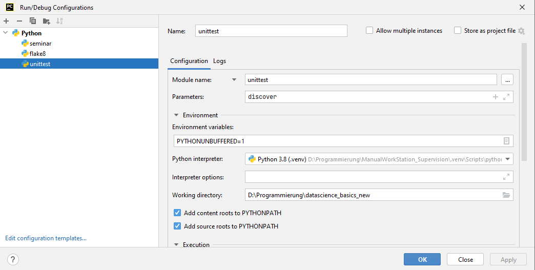
A unit test is a smaller test, one that checks that a single component operates in the right way. A unit test helps you to isolate what is broken in your application and fix it faster (Python Testing).
There is a unit test in seminar.tests that uses this file for validation of your dataframe.
- Use the
unittestmodule to start the test and check if your obtained dataset.
Data Visualization
A waterfall diagram should be created to visualize the obtained dataset.
- Use matplotlib (
imshow) and the preprocessed data to create a waterfall diagram. This plotting method makes the assumption that the data is equally spaced. It draws the plot faster compared to other methods, for examplepcolormesh, which does not make this assumption. - Label your axis (x, y, and the colorbar), and use the arguments from
imshowto update the scaling of your plot.
Use the Matplotlib examples at the bottom of the page (Matplotlib imshow Documentation) to see how you can adjust your plot.
Summary and Outlook
Lessons Learned "Pandas"
- Pandas is handy in comparison with NumPy.
- Pandas can do powerful aggregations of indexed data.
- Pandas supports multi-indexed datasets.
- We recommend using Pandas with index columns. The index is kept when a subset is viewed.
- It can be complicated to understand when Pandas is returning a view on the dataset, an instance, or a copy of the data.
- Be aware that NumPy sometimes performs faster than Pandas in third-party applications (e.g., scikit-learn).
Measurement Errors
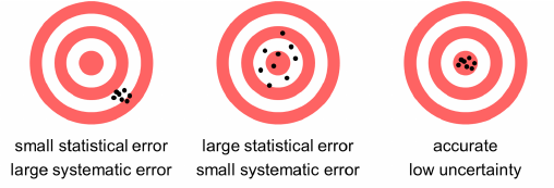
Usually, you have a hypothesis and need to prove if it is right (or not). Thus, you need to collect data. However, most measurements have errors, and some calculations with data introduce errors, like the calculation of an average, which also produces a standard deviation from that average. Initially, the errors are often so large that your hypothesis cannot be accepted or rejected. Additionally, the addition of more data will result in sharper error distributions, which will allow us to accept or reject the hypothesis with specific confidence.
- In general: Don't believe data without error bars!
- Use weighted regressions to take the error into account.
- Calculate errors when you aggregate data (i.e., standard distribution).
- Use error propagation when you derive values with formulas that have input with errors.
- By the way: All sensors have measurement errors given by the manufacturer.

Next Steps When Analyzing the Data
There are automated approaches to extract features from the dataset. These approaches are used to categorize often multidimensional datasets into a number of categories. These approaches are covered by libraries such as SciPy.
First, we focus on the manual feature extraction, which starts by looking at the data:
- Can you see special behavior?
- What is good data, and what data is polluted?
- Does your data behave like your model or a physical model?
- Does the data prove or disprove your thesis?
Looking at the waterfall diagram, we see all the data, and we can extract features. For example, we are interested in the signal-to-noise ratio over the measured frequencies. Just by looking at the data, we see artifacts, areas with much pollution, and areas where our transmitter seems to be the only source.
This leads to the following questions:
- What is the noise level?
- How high is the signal?
- How can artifacts be excluded?
And thus, you need to look at all measured frequencies. A time-over-frequency plot results in a graph where you can try to extract features. The difficulty here is that the data is polluted and that you cannot easily see the same features from the waterfall diagram because the line weights are too thick.
A solution can be to use a smoothing function (running averages); however, they average over the data, which is often not beneficial. A second solution is to use dots instead of lines, which might point to a different picture. However, in many cases, a histogram of the data is a powerful method to find features.
A histogram offers a time-independent look at the data, and we can use it to easily measure the noise level by fitting a function to the noise. With the noise known, the signals can easily be separated from the noise. Using a histogram and deriving parameters reduces the dimensionality and complexity of the dataset.
In our example, the classification of the noise condenses hundreds of data points into two numbers (the height and position of the fitted distribution). Thus, the next step would be to create histograms for each frequency band.